Designing a mobile learning platform that empowers low-income learners to access free courses, learn offline, and feel supported through community interaction.
Education
Mobile
Case Study

ROLE
TOOLS
Figma, Adobe CC
TIMELINE
PLATFORM
The Challenge
Online education is everywhere, but access isn’t equal. Most platforms assume users have stable internet, money for subscriptions, and enough confidence to learn alone. From my research, this is not true for many people. Lessonary explores a simple question:
How might we help people with limited income learn consistently, even with poor internet access and little external support?
Why It Matters
Education is a fundamental right. By designing an experience that is affordable, intuitive, and supportive, Lessonary can unlock potential for underserved learners and bridge the education gap.
Accessible Learning
Enable learners with limited income to access quality courses for free.
Offline Capabilities
Support learning anywhere, even without consistent internet.
Community Engagement
Build interaction through forums and social features to keep learners motivated.
The Method
Conducted interviews with students and job seekers from diverse age groups to understand barriers in online learning.
Key Findings
Many learners don’t know where to start with free learning options.
Users need support mechanisms — current platforms lack interaction and personalization.
Connectivity issues block continuous learning for low-income users.
User Needs Identified
Easy discovery of relevant courses
Support when content is difficult
Offline usability
Based on user feedback and research insights, I focused on four core features:
Offline Mode
Access downloaded lessons anytime, even without an internet connection.
Discussion Forum
Learners can ask questions, share insights, and collaborate among each other.
Achievement System
Badges, certificates, and progress tracking to motivate continued learning.
Ad-Supported Modal
Placing ads at natural break points to support a 70/30 creator revenue split.
First, I sketched the key user flows to understand how users would move through the product. These flows included discovering and enrolling in courses, playing courses offline, participating in forum discussions, and earning badges through achievements.

Key Learnings from User Testing
✔️ Users loved the offline download feature
✔️ Forum added a sense of community and motivation
✔️ Learners wanted instructor info and course progress at a glance
✔️ Dark mode and adjustable text size were common accessibility needs
Design Adjustments Implemented
Added profile info for instructors
Introduced customizable font sizing
Included dark mode toggle
Improved progress visibility
After the usability study of the low-fidelity prototypes, I created high-quality mockups based on feedback and ideas from participants. These designs show the critical user flows that improve the overall functionality of the app:
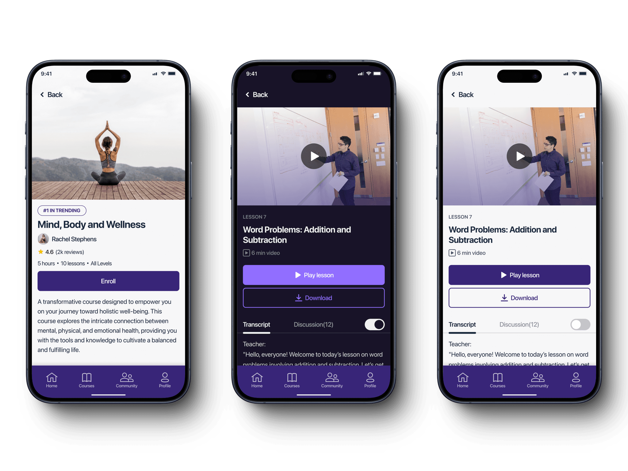
In the Courses tab, users can search, filter by category, or choose from recommended courses to enroll in their preferred option.
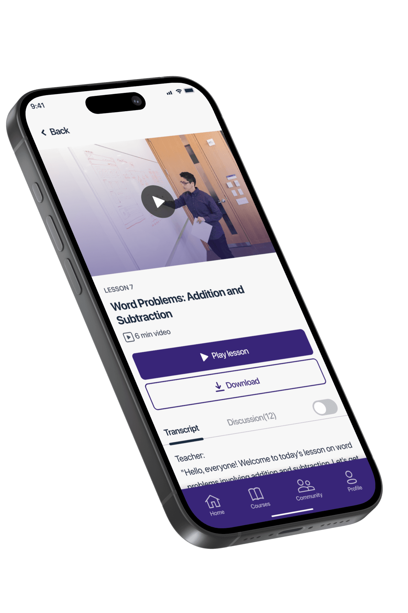
After a user picks a course, they can see their progress and continue by clicking on where they left off. This takes them to a video player where they can watch the video and also see a transcript of it.
Users can ask questions, share ideas, and talk about course content. This helps create a community where people can work together. Notifications for replies and new posts are also included, which encourages users to join in and participate more.
To reach a global audience, the app needs to provide multi-language support. Users can pick their preferred language from a variety of options, which makes it easier for people from all around the world to use the app. This creates an inclusive environment and makes sure that language barriers don't stop anyone from accessing quality educational resources.

Every learner may have different visual needs, so providing adjustable text size is important. This makes it easier to read, navigate, and engage with the content.


This project reinforced that inclusive design needs empathy, testing, and iteration. By deeply understanding user pain points, we crafted an experience that truly supports learners who are otherwise excluded from traditional platforms.
Lessonary is a bridge to lifelong learning. By focusing on accessibility, usability, and community, this project demonstrates how strategic UX design can drive real impact.