A conceptual UX project focused on fixing user frustrations and organizing the interface while respecting a 25 year old community.
ROLE
TOOLS
Figma, Adobe CC
TIMELINE
PLATFORM
This project is a personal, non-commercial UX concept. It is not affiliated with, endorsed by, or connected to Ekşisözlük or its owners. Ekşisözlük is a registered trademark of its respective owners.
01.
Ekşisözlük is more than a website; it is Türkiye’s biggest digital community and archive. It has millions of users who value its "minimalist" and "anonymous" style. However, the interface has not changed much in 20 years, leading to many usability problems.
The Problem
The platform feels outdated and slow. Users face major "friction" in a few areas such as content discovery, notification management, and media consumption.
The Goal
To modernize the user experience without changing the culture.
I focused on making the platform more efficient and easier to navigate while keeping the reading-first experience.
02.
Before designing, I set three rules to guide my decisions:
Reading is Primary
Every feature must support reading, never distract from it.
Refinement Over Reinvention
Fix what’s broken without changing what already works.
Efficiency First
Reduce steps and clicks needed to find information.
03.
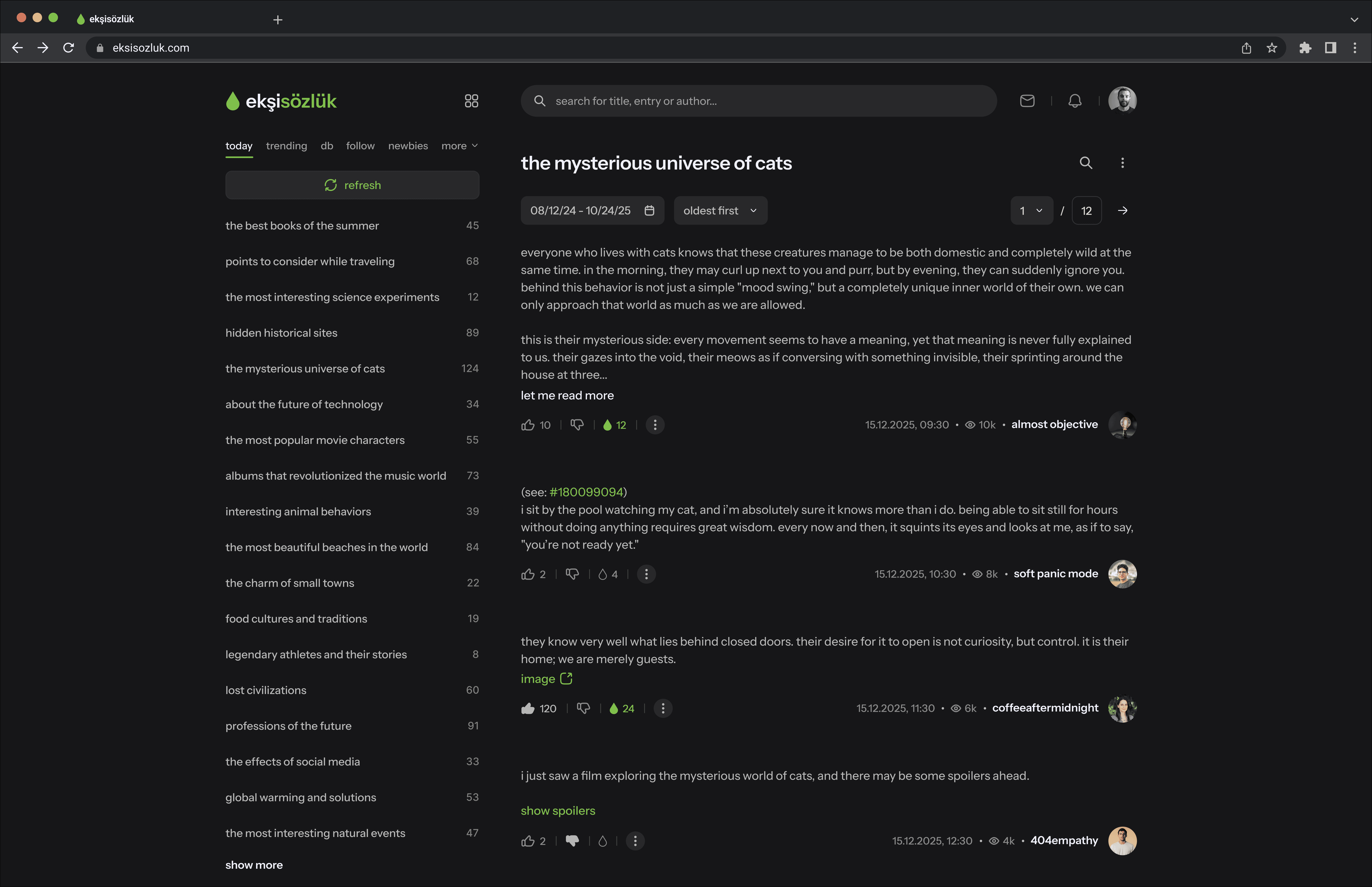
Currently, Ekşisözlük lacks a way to filter entries by date, making it very difficult to browse the topics efficiently. Users are forced to manually click through pagination, guessing where a specific date might be located. I solved this by adding a calendar-based date picker to the topics. This allows users to select a specific day or a date range to find content instantly.
CURRENT
User goes through the pagination to find a specific date.
IMPROVED
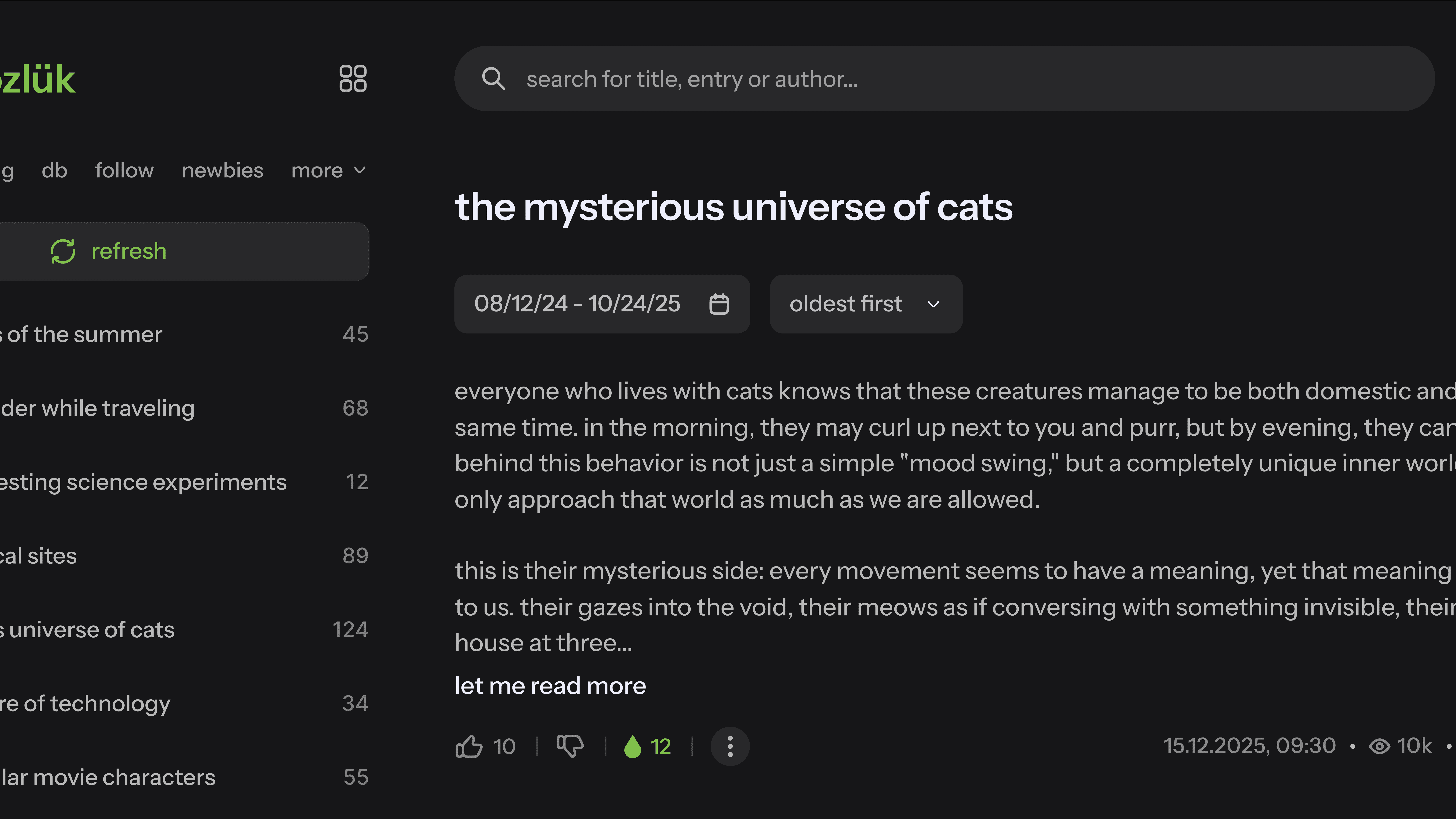
Jump to any date in seconds instead of manual page skipping.
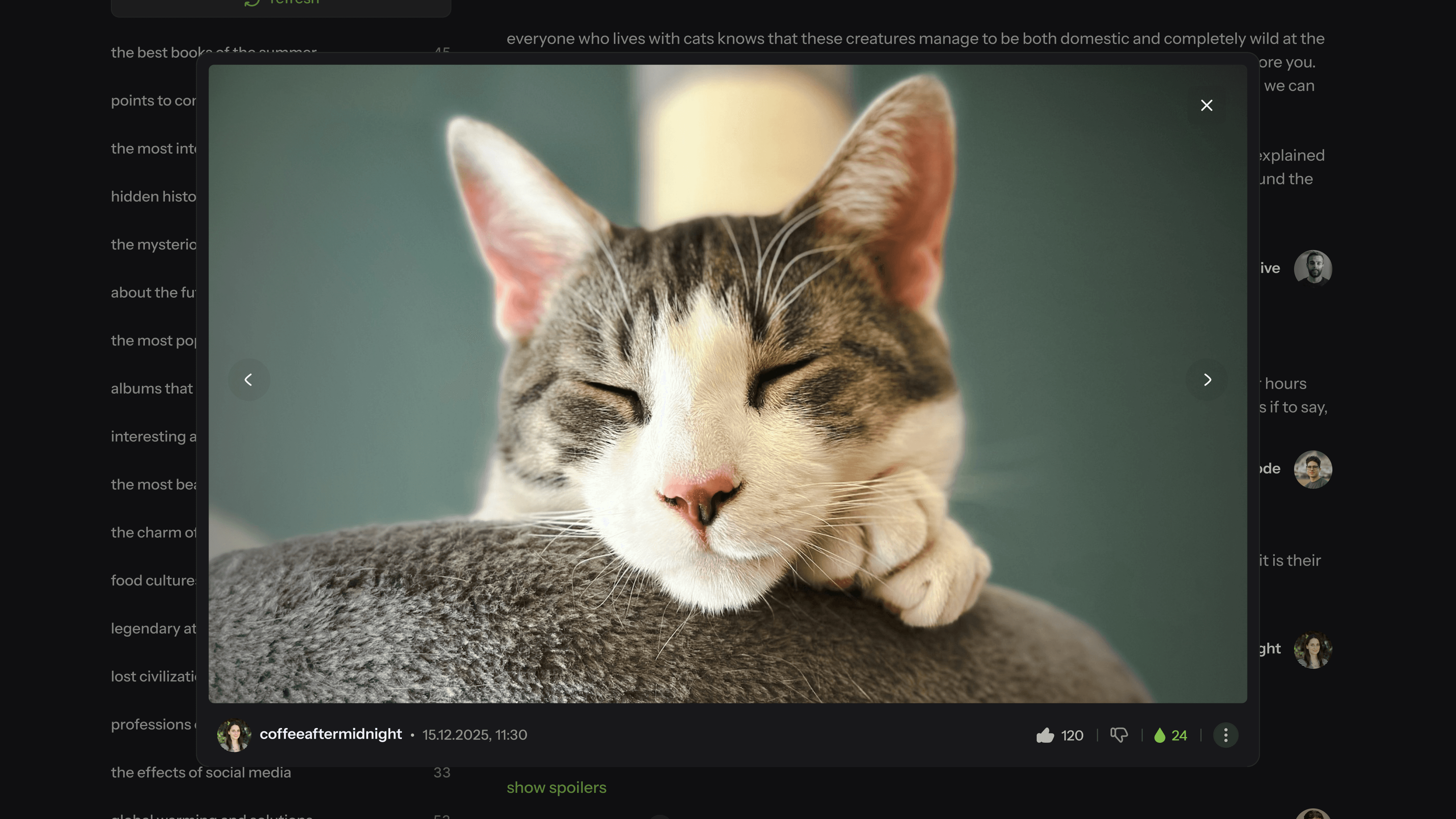
The current media experience is disjointed because clicking an image forces it to open in a new tab. This breaks the user's reading flow and disconnects the visual content from the entry. My solution introduces an integrated lightbox gallery that allows users to view images instantly without leaving the page.
CURRENT
Clicking on an image opens a new tab to view.
IMPROVED
The legacy notification system is a "wall of text" that only shows followed topics, while other notifications like messages, likes, or favorites are scattered in different sections. This creates a high cognitive load as users must navigate to different pages to see their activity. I replaced this fragmented system with a centralized dropdown menu that consolidates all notification types into one scannable list. This allows users to stay updated on their social interactions and followed content in a single view.
CURRENT
Notifications only show the topics the user follows.
IMPROVED
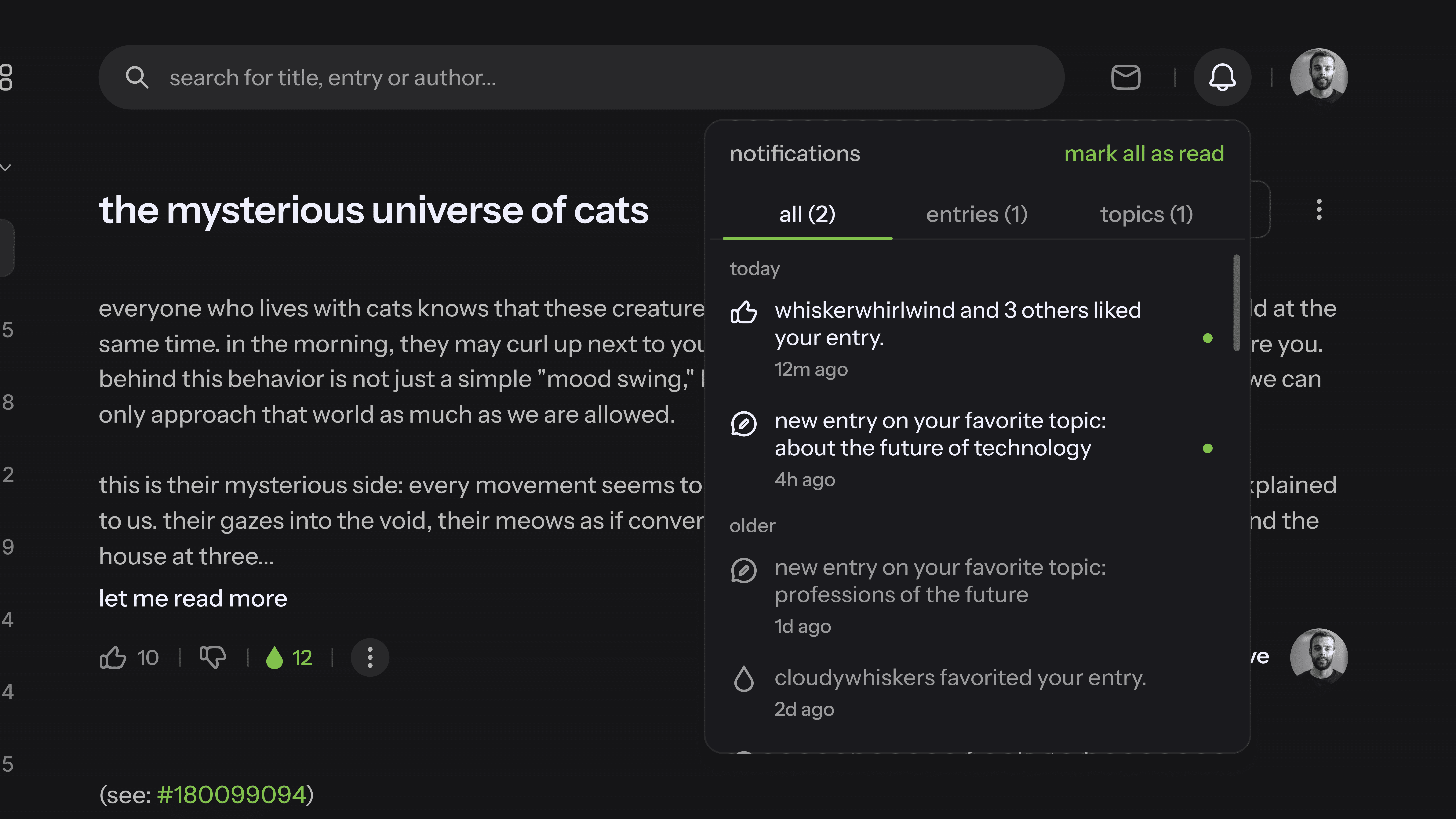
Grouped categories (messages, likes, topics) for faster scanning.
While the messaging interface needed better legibility and a clearer hierarchy, I intentionally avoided "real-time" features like typing indicators or "seen" receipts. In an anonymous community, these features create social pressure. My redesign focuses on a clean, asynchronous layout that matches the platform's calm and text-heavy nature, making the tool more usable without changing the quiet social contract of the site.
CURRENT
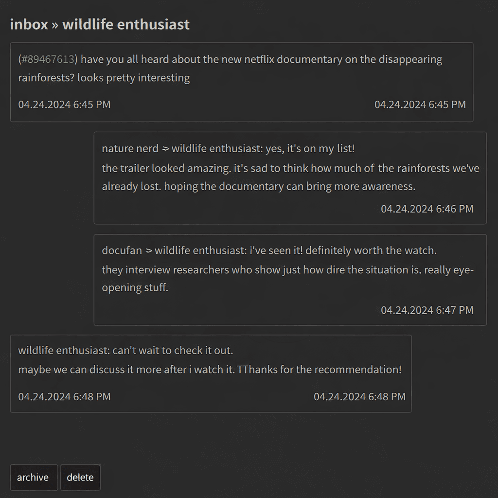
IMPROVED
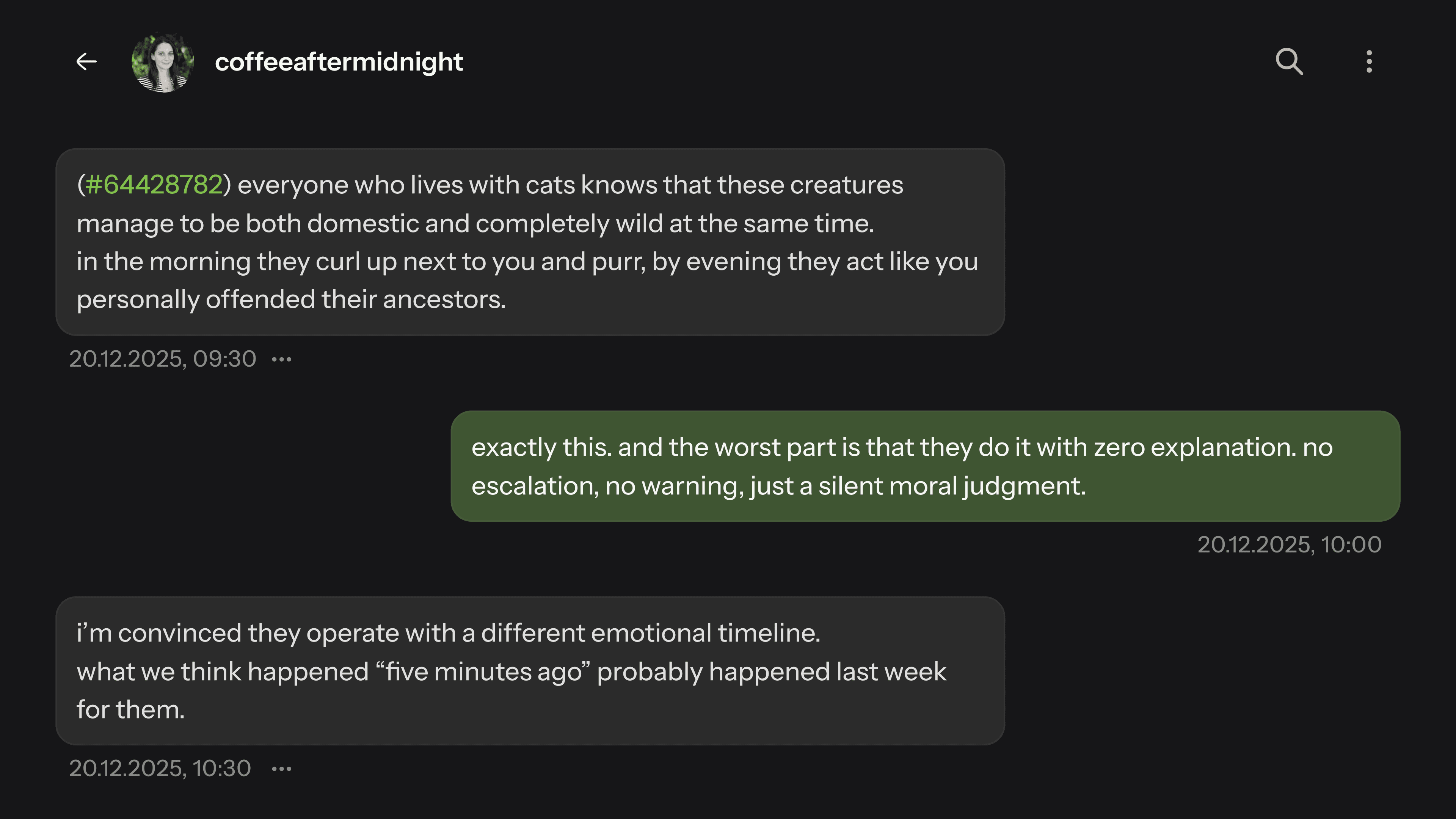
Clear visual hierarchy while respecting the user privacy.
Accidentally seeing a spoiler for a movie or book is a common frustration for users due to the current system’s lack of security. To fix this, I redesigned the spoiler interaction to require intentional disclosure. All spoiler content is now completely hidden behind a protective layer that only reveals itself when a user makes a deliberate click. This small but vital change builds user trust, allowing the community to browse potentially "risky" threads with total confidence that their reading experience won't be ruined.
CURRENT
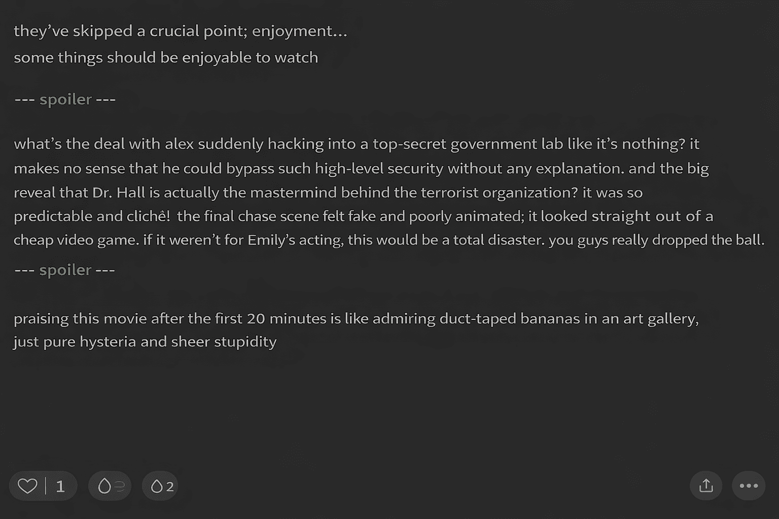
Spoiler content is visible by default.
IMPROVED
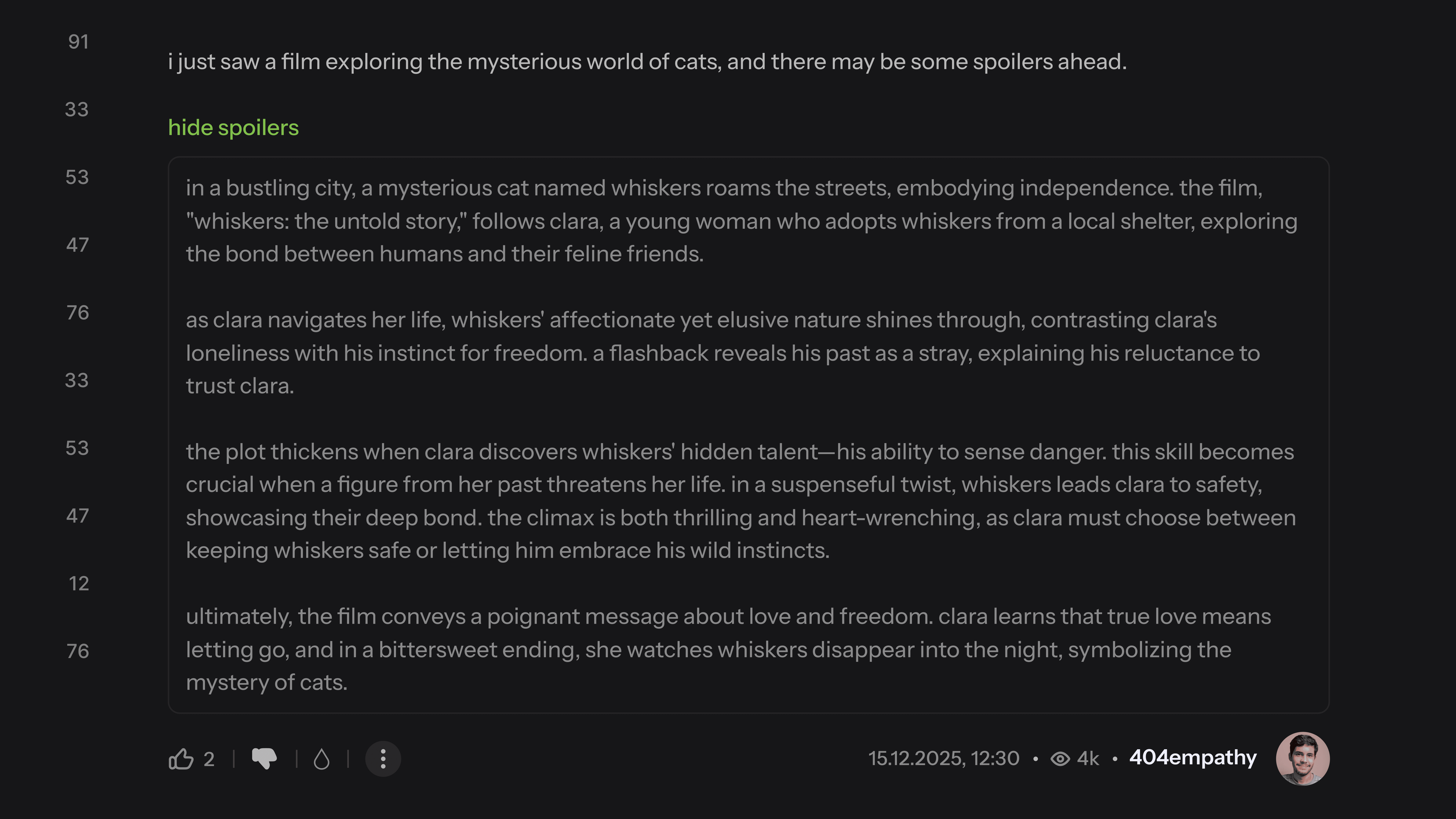
Clear button that shows and hides a spoiler content.
Overview
This conceptual redesign demonstrates how ekşisözlük could feel modern without losing its soul. The result is not a "new ekşisözlük", but a better version of the same experience.
Reflection
Designing for a platform like this requires restraint. The hardest part was knowing what not to change.
This project reinforced the idea that great product design is often about understanding culture, removing friction, and making improvements feel inevitable rather than impressive.